Sunday, November 30, 2008

Almost nonsensical fangirling...

This doesn't really have anything to do with graphic design... I just wanted to blog about it.

Tonight I attended my sixth Dir en grey concert! SIX. Oh god... I think I've been to too many? I don't know. I still love them! My hearing is shot, but it's okay.

I got my CD signed this time at the meet & greet! Funny, it was the same two that I got to meet last time at the Family Values Tour--Shinya and Die. Except that last time, we got to shake their hands, and this time, we got signed CDs. Shinya is so beautiful... and Die is so handsome... hmmm... yes. The concert was fun. The setlist was familiar. I was hoping they would play more of their new songs, but they only played 4. I think that it's just because I've been to soo many of their concerts that the songs seem familiar hahahaha!

Picture flood ahead:


My Dir en grey CDs thus far. Hmm... I'm detecting a theme in their CD covers...


My signed CDs~ (12012, Dir en grey, Olivia, Duel Jewel, & Blood)


Signed poster from Rockstar Taste of Chaos. There are 13 signatures on this baby!


Signed poster from Duel Jewel... gah... what a badly designed poster, eh? To be fair, they were barely beginning their career when I got this one signed.

My mother thinks I should stop bringing home "useless signed merchandise"... but I think she's wrong...


These are the ticket stubs to everything I've been to... I'm missing the ticket stub for the BLOOD concert, though :( They TOOK OUR TICKETS at the door for that one. Boo to them! And the Duel Jewel concerts didn't have tickets~


These are my Jrock related tickets. The entire left side are the shows I've seen Dir en grey at.

Wednesday, November 26, 2008

Faberge eggs & Rapunzel

I found these and thought they were soooo pretty! Awwww... they're so delicate and beautiful!! They remind me of Rococo <3 Oh, speaking of which, I'm excited that Disney is going to be doing Rapunzel :] The movie's style is inspired by the painting "The Swing" by Jean-Honoré Fragonard. It's going to be CG, but director Glen Keane is working to give it the traditional feel of a hand-drawn Disney classic. Wiki states "To create the impression of a drawing, non-photorealistic rendering is going to be used, making the surface look like it is painted but still containing depth and dimensions. Sounds exciting, I can't wait! I love Rococo! Ooh, and here are some eggies for you :)


And "The Swing"!


Character design for Rapunzel ^_^

A random collection of ads...

Wow, does this totally trip you out, because it trips me out. My eyes can't seem to decide whether it thinks this is cool or if it's in pain from all the bright colors hahahaha


I found some anti-smoking ads as well. People usually get pretty creative with non-smoking ads. Here's a few that I came across today:


This one in particular was really strong to me...


I also found this one, which I thoguht was pretty clever. Too bad I can't read the language! My first impression is that it's for a shampoo... but maybe it's for a comb company?

Tuesday, November 25, 2008

Cute.

I was at Joann's last night, buying felt for my portfolio project and I saw these... I thought they were really cute. The packaging is simple and childish and... the poop is too funny hahaha


I think these would be great Christmas gifts for both kids and adults. It's sort of gross, but not in an offensive way. Except for the part where the poop is edible since they're jelly beans... haha well, I don't think anyone will really take offense to eating the poo. Those things are just that cute :)

Tuesday, November 18, 2008

Yay! And.. am I seeing double?

My computer is back from the dead. Love, don't leave me again!

Also, I saw this Moschino ad today and it immediately reminded me of Miyavi's video for his song "Senor, Senora, Senorita." Take a look:

Screencap of Miyavi:


The Moschino ad:


What do you think? It's hard to tell from the picture, but Miyavi makes that very same face that model is making... quite often. I can't remember if he makes that face in this particular video, but he does it a lot in photoshoots.

Monday, November 10, 2008

Veterans' Day

Veterans' Day is coming up, so I wanted write a little in honor of my veteran friends, who spend 9-12 months at a time overseas. My three closest guy friends are all in the armed forces. Two are in the US Marine Corps and one is in the US Army. It always makes me incredibly happy whenever they arrive home!

My best guy friend just came back from Afganistan at the end of October. Prior to that deployment, he was in Iraq. He was only here in California for a week, and now he's back in Camp Lejuene in North Carolina. My other friend in the USMC is reserved duty. He's only been on one deployment to Djibuti. My friend in the Army is currently in Iraq, but was deployed to Kosovo about two years ago. I write to them often, and I'm always ecstatic when I get a letter back. One, because I love getting letters, and two, because it means that they're alive.

Currently, there are only 198,000 active duty and 40,000 reserved duty Marines. That makes them the smallest branch of armed forces that we have. So their motto "The few, the proud, the Marines" really applies. They say that the Marines are also the toughest branch to join, and of course, they're always the first ones sent to fight :( Anyway, I'm very proud of my three boys :)

But what I've been trying to get to for the last three paragraphs is the USMC emblem. The one that we see today has been around since 1868!! It consists of a globe of the Western Hemisphere, an intersecting foul anchor, and a surmounted eagle. Above is a ribbon with their motto "Semper Fidelis," meaning "Always Faithful." The globe signifies service in any part of the world, the eagle also indirectly signifies service worldwide, and the foul represents the amphibious nature of the Marines' duties. Their colors, scarlet and gold, surround the emblem as the official Marine Corps colors and all of it is enclosed in navy blue and gold to signify USMC as an integral part of the naval team.

I personally think that their emblem is very strong. To me, it represents strength and unity. But I wonder if it's because I know people in the military, and that's why it represents those things to me. What does it represent to someone who doesn't know anyone in the military? I think that the emblem will represent different things to different people, depending on their experience with it. For example, if I didn't know anyone in the military, I wouldn't think much of the emblem at all. But since I do, I feel a little pang in my heart every time I see it.


The official emblem.


Emblem as a patch.


And how awesome it looks on the hat of their Dress Blues uniform!

P.S. November 10th is the 233rd birthday of the USMC~

Sunday, November 9, 2008

B&BW

Do those Bath & Body Works lotion bottles ever make you hungry? I don't know if they make me hungry hungry, but I know that when I see them, I want to eat fruits--not necessarily the bottle of lotion haha. They just look so darn tasty :[

But fruity stuff aside, I really like how simple they look. The image is the #1 thing, but the name of the scent is big enough so that you'll read it immediately following the picture. Everything is balanced and nothing is struggling for your attention.

Monday, November 3, 2008

Puppy Mills :(


There are places all around the country where female dogs are kept for the sole purpose of breeding. When they get old, they get killed off to make way for younger female dogs to breed. These breeders then sell the puppies to unknowing pet stores owners everywhere.

I thought that this ad was pretty depressing. Very well done, but disturbing. It made me feel really sad, so they got their point through. They remind me of the AIDS ads that Byron Huitz from my ART408 class put up, except that those were so obscene that they were a little bit funny in their shock. But I don't find this ad funny at all :'(

Sunday, November 2, 2008

Coraline.

Today I saw the poster for the movie Coraline :) I thought it looked pretty cool, so I wanted to share!


The movie is based on a book about a curious little girl who walks into an alternate universe that is very much like her own, except that things are better. Things happen, and she has to rely on her resourcefulness to get home.

I thought this was a cool poster for an animated movie because most posters for animated movies are super bright and happy, with smiling characters bursting off of the page. I like how simple it looks. I suppose it has a pretty eerie quality for an animated kids film.

Friday, October 31, 2008

Happy Halloween

Here's something cool from Tim Burton :D

Sunday, October 26, 2008

He's there, inside your mind.

The Phantom of the Opera is probably my favorite play :)

Even if you've never seen it before, I bet that just thinking of the name brings forth that image of the Phantom's mask. It's so beautiful! I absolutely love the mask icon for Phantom. Just by looking at it, you can see the mystery and feel the tragedy behind it. The typeface for the logo is pretty normal looking. From far away, it looks like normal text that's a little distorted, but when you see it up close, you can see that the text resembles shattered glass.

Sometime in the future, I'm going to be Christine for Halloween. But I'll have to convince someone to be my Phantom, first! It's going to be great!

Thursday, October 23, 2008

TRUE BLOOD!

I was on the Communication Arts website (www.commarts.com), and I noticed that their 10.21.08 exhibit is about True Blood, and so is their 10.09.08 web pick of the day. I recently started watching the show (which I love love love love since I love vampires!), so this was a really fun surprise for me to find it on there.

The 10.21.08 exhibit is about the show's title sequence. I agree with what the Comm Arts website says about it, and what I thought was interesting the first time I watched the opening sequence was how different it felt from those giant TRUE BLOOD posters. The posters look very sleek and sexy. It has a dark and cold, "gothvamp" feel to it, which is pretty stereotypical. They look more like an advertisement for the vamp bar in the series (Fangtasia--as vampire Bill explains, most vampires are very old, and at the time they were created, puns were the highest form of humor).

But the opening sequence is so different. The colors look a little dull, but the content is messy and chaotic. There's a lot of carnage and it looks real trashy. The images used are those that one might associate with small southern towns of clashing mindsets; small children, deadly or dead animals, African-American folk in a church, prostitutes, old buildings, and all that good fun. The song choice is "I Want to Do Bad Things With You" by Jace Everett, and it's pretty suggestive, as you probably guessed by the title. Overall, I think the opening sequence is great. It really sets the mood for the whole show and the producers did a fantastic job.

The 10.09.08 web pick of the day showcased a very interesting advertising campaign for Tru Blood--the fictional synthetic blood drink for vampires. It's also interesting to note that they really went all-out while advertising for show by advertising for the drink. If you look in youtube, there are fictional videos about it made by the advertising campaign. It actually reminds me of how The Dark Knight advertised for the movie by advertising for Harvey Dent as a real candidate.

The poster!


The opening sequence!

Sunday, October 19, 2008

Alice Addict.

I love Japanese artbooks! Page after page after page of art!

I've been thinking that I want to purchase Mihara Mitsukazu's Alice Addict (2003) artbook. I adore her work :) Sasuga.com's description for the product is:
"A combination of punk, Gothic and Lolita, this collection of drawings by Mihara Mitsukazu will thrill any Gothic and Lolita afficionado. It features full-color illustrations, and two pages of cut-out dolls."

(Cool & Interesting Note: Mitsukazu is also the creator of the Doll manga. It's about a world where human-like androids are created to make our existence easier. It explores the action of the users, the people and the relationships that surface between the two. What makes us human?)


(Those are wires tied up in her legs. Not a garter belt...)

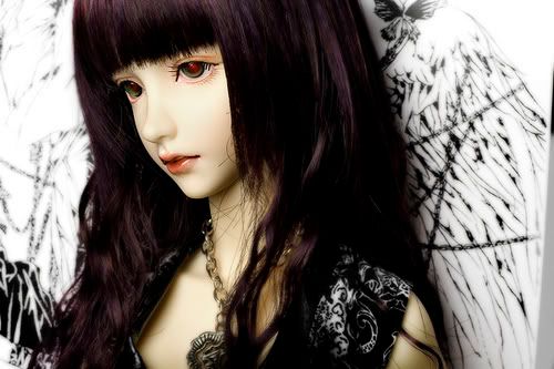
Speaking of dolls, my name on here is ball-joint doll. These Asian ball-joint dolls called "Dollfie" are really beautiful. Here are some examples:


These things are ridiculously expensive... they can cost you into the thousands.


Look, it's Jareth, the Goblin King! He saw his baby crying hard as babe could cry... what could he do? Dance, Magic Dance!
(Please don't let me be the only one to get this reference...)

Is it winter yet???

I can't wait for winter to arrive because winter means snow, and snow means winter sports, and winter sports means... snowboarding! This is a very exciting time for me because it means I'll be able to fall on my face and tumble over air more than I usually do... all the while, having my feet bound to a board :) Yes, I enjoy snowboarding, even though I can only do two things; 1) move forward and 2) stop! Fun times aside, this season is exciting for one other reason. Soon, all the spiffy new snowboard designs will be on display in their full glory at sporting stores everywhere!

I've always noticed that snowboard designs are really special. There are so many to choose from, and so many colors, so there really is a perfect board for everyone out there. I think it's really neat that the designs are so versatile. Some feature very clean, slick designs, some are very loud, some are subtle and elegant, some are fun, and some are funky. Graphically, you can really find something for everyone in snowboards. It's true that the "only people" in their audience are snowboarders, but hey... just because they like sports, doesn't mean they have to have a "sporty" snowboard. They can be as loud and as expressive as each unique person :)

Here's a sample of some mens' boards:


Here's a sample of some womens' boards:


Oh... I think that a Batman snowboard would be the most awesome board in the world! It would be so sleek and sexy. Not boring and primary-colored like some other brightly-dressed superhero we know.

Sunday, October 12, 2008

I'm not really this geeky.

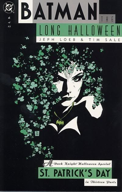
Yay for Batman! I was browsing online, looking for Halloween themed movies and or books that I could enjoy for the remainder of this month, and I saw this cover for a Batman graphic novel issue and got really happy and distracted because 1) I'm a huge Batman fan, and 2) I thought this cover looked awesome!


I really like this!! It's actually one in a series of 13, I believe. I feel that it's very simple and effective and totally catches your eyes because of the contrast. But even though it's simple, you can still see a lot of details.

Speaking of eye-catching Halloween-related covers... this one sort of reminds me of Rocky Horror Picture Show because of the striking colors against the black background. Huzzah for Rocky Horror as well :)


Oh, and in case you were wondering what happened to my Halloween search, it didn't get very far because once I hit that Batman cover, and it reminded me of Rocky Horror, I thought of David Bowie because of the 70's, and it was GAME OVER for my Halloween searching. I think I'll just re-watch The Nightmare Before Christmas again, as I do every Halloween season!

Saturday, October 11, 2008

Kinokuniya!

Yesterday I went to Little Tokyo with Jennifer Oh from my ART408 class to take some pictures for our second project. We found a graphic design section when we went to Kinokuniya Book Store! They had a bunch of really cool stuff! :) There were books for icons, books for environmental art, books for graffiti art, and pretty much anything else in the field.

They had a lot of really great things in there, though. They have books for arts & craft like origami, sewing, and various others. And of course, they had a HUGE manga (graphic novel) section. They also have CDs and DVDs, too. They also have Japanese magazines... lots and lots of them. There are even magazines for jewelry. And another one for nails. And men's hairstyles!

In case you wanna check out the bookstore, here's the address:
123 Astronaut E S Onizuka Street
Los Angeles, CA 90012

Sunday, October 5, 2008

Ricoooolaaaaa!

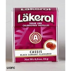
Swiss packaging is so fun! Have you ever had those really cool boxes with Swiss candy? I think they're ingenious because they snap close with that nice clicky feel--even though the whole box is just made of paper. And they never break either!

I also like how they have something written underneath the cap when you flip it up.


Saturday, October 4, 2008

Library visits.

Earlier this week, for my ART454 class at Cal State LA, I had to do a bit of researching for my first project. My professor, Jimmy Moss, suggested I try the library, so I did. It took a lot of digging and flipping through books and a paper-cut in between, but after a long while, I finally settled on six books that I could use! The process was tiring, as I had just gotten off a long day of work, but in the end, it was well worth it. I found some useful images to use, and after they were scanned into my computer, they were all nice and high in resolution! Thanks for the advice, Jimmy!

Friday, September 26, 2008

CDs

Has anyone else other than me ever noticed that in general, American CDs have pretty plain covers with boring packaging? Most of the time, they just look lazy. I was looking at my small (but expensive) collection of visual-kei CDs, and I realized that those CDs are much better looking than any American CD I've ever bought. It looks like the Japanese really go out of their way to make sure that their products look extra nice. They booklets that come with the CDs are always printed on beautiful paper, too.

Japanese albums generally cost between $28-45, but I think that they're worth it. They really take their time to put a lot of care into their products! When an album is first released, you can get them on pre-sale and they'll come with really fun promo gifts! They almost always come with a poster. But I've seen cellphone accessories, stickers, and other cutesy stuff, too. Even for the rock bands. It's not just albums that have fun promo items, either. In Japan, the success of an album is based very strongly on the sales of their singles. Singles are usually about $20.

Here are some examples of some of my CDs. First photo is of my beloved collection. #1-6 are Japanese, #7-8 are American, #9-10 is a comparison of sizes.


1. Gackt - Love Letter (outer CD sleeve, custom CD case made of material like an ancient love letter, a really fat booklet)
2. Gackt - The Sixth Day (outer CD sleeve, 3/8" thick CD case, two CD booklets)


3. Malice Mizer - Bara no Seidou (outer CD sleeve, 3/8" thick CD case, thick booklet)
4. 12012 - Play Dolls (5/8" thick case, 2 CDs, sticker, booklet)


5. Dir en grey - Vulgar (1/2" case, one thick booklet, one small booklet)


6. Dir en grey - Withering to Death (1/2" case, one REALLY thick booklet)


7. HIM - Razorblade Romance (3/8" thick CD case, thin booklet)


8. Blaqk Audio - Cex Cells (3/8" thick CD case, thin booklet)


9. 12012: 5/8", Dir en grey: 1/2", HIM: 3/8".
10. 12012: 10 pages, Dir en grey: 20 pages, HIM: 4 pages.

Thursday, September 25, 2008

Not design related, just a fun FYI

In my earlier blog, I made a reference to Novala Takemoto. I just wanted to write a little about who he is, and what he does.

Novala Takemoto is a Japanese author and fashion designer. I have read translated interviews, and one of the cutest things Novala has said was that he claims to have the spirt of a young maiden! And yes, he is heterosexual. Like myself, Novala promotes the popular lolita lifestyle. He is perhaps most famous for his book Shimotsuma Monogatari (English title: Kamikaze Girls), which became a movie in 2002, starring Kyoko Fukada and Anna Tsuchiya. Novala also modeled his clothing line, Pour Lolita, which he designed for Baby, The Stars Shine Bright and can be seen in The Gothic & Lolita Bible.

In October 2006, I attended the Pacific Media Expo (PMX) at the LAX Hilton Hotel. PMX held a Lolita Tea Party--which I didn't attend because seats were too expensive for me at the time--so Novala was one of their guests of honor. He was to attend the tea party and to hold a panel discussion. I actually attended the Expo for the Olivia concert, but I did bump into and take a picture with Novala! I was waiting for something that I can't remember right now, but I saw Novala standing about five feet away from me and the only thing I could think was "OH. MY. GOD. THAT CAN'T BE HIM." About twenty feet away from me was this huge line of lolitas waiting for the panel to start, and they had no idea he was right there. So I quickly went up to him and asked if I could take a picture with him. He said yes, and this was the result!


After me, the lolitas finally took notice. I'm proud to say that I was the first and one of maybe 10 or less girls who got to snap a picture with him :)


(L-R) Kyoko Fukada, Novala Takemoto, Anna Tsuchiya.


Novala in a BTSSB spread.

Hello, Kitty!

I never really thought too much about Hello Kitty, except for the times when I saw something really adorable and really wanted it. But I was on my way to campus today, and I noticed that the car to the right of me had these white blobs on their windows. (No doubt, the parental units gave their child free range to embellish their back windows.) They were the backing of the stickers, but I instantly knew that it was Hello Kitty's silhouette. So I started to think about her and how much of an impact she's made since her arrival in 1974.

I learned that Hello Kitty is more than just a Sanrio character from Japan. In Asia, Hello Kitty is likely the equivalent to the combination of Mickey Mouse and Barbie. She's unbelievably cute, and super stylish through her many personas. She sells everything in the world, too. You can literally find Hello Kitty wherever you look; she's in clothes, jewelry, furniture, bedding, accessories, toys and plushies, purses, school supplies, DVD's, make-up, wedding dresses, electronics, cookware, cars, credit cards, guitars, sewing machines, motorcycles, lunchboxes, and the list can just go on! But she's more than a money-making mogul. I bet you didn't know that Hello Kitty is Japan's tourism ambassador. Also, in Bangkok, when officers are late to work or park in the wrong parking space, they are forced to wear bright pink Hello Kitty armbands with hearts on them for several days as punishment. They thought that even these minor offenses should never be ignored and that this would be an effective way to limit such behavior of their police forces. Even celebrities like Mariah Carey and Dakota Fanning have love and endorsed her in the past. She's even got contracts with Tokidoki and Bathing Ape's Baby Milo to produce even more absurdly cute creations.

But when I think about it, she's just a 2D cat with a head too big for her body and no mouth. Her earlier incarnations were rather plain, with just a red bow on her ear and blue overalls over a red shirt. Basically, she was just another character to add to the world of Sanrio. I doubt that the group of designers who created her would have ever dreamed that she would become this big. After all, she was just a tool to sell a few items. Yet somehow, she grew and grew into this marketing phenomena. I'm not sure what happened along the way, and why Hello Kitty is still the most popular character after 34 years, but what those designers at Sanrio really hit the jackpot when creating one of the most recognizable characters of our time. I can only hope that one day I'll be part of a team that can achieve something this successful. This little cat sure is something, isn't she? Oh, and she has a theme park, too.


(Top-Bottom, L-R) The two mugs and three cellphone accessories are from the Novala Takemoto Hello Kitty Pour Lolita collection--my personal favorite and available only in Japan. The stickers really do make my phone and flashdrive much cuter!


(Top-Bottom, L-R) A spinning pen holder with scissors, a ruler, and other misc. items, a really old address book, a notebook, a pack of stickers, and two really old jewelry boxes from the 90's.


(Top-Bottom, L-R) A pen holder, Y2K special edition Hello Kitty astronaut from McDonald's Hong Kong, VHS's, and Dear Daniel from the same McDonald's campagin.

I'm positive I have some really old items lying around or packed away somewhere, but this was probably a good amount of items to display.

Threadless

I was surfing the web for that "Pandamonium" tshirt and after about two seconds, I found it on the site Threadless (www.threadless.com) and I looked at all the other shirts. They're really cool! Some are cute, some are funny, some are werid, and some are morbid, but you get the picture. They're all designed by artists and there's a wide array of clothing to choose from, all of which should satisfy your need for a fun new shirt with spiffy original art!

Check it out when you have time!


The above art belongs to Ross Zeitz.