Here's something cool from Tim Burton :D
Friday, October 31, 2008
Sunday, October 26, 2008
He's there, inside your mind.
The Phantom of the Opera is probably my favorite play :)
Even if you've never seen it before, I bet that just thinking of the name brings forth that image of the Phantom's mask. It's so beautiful! I absolutely love the mask icon for Phantom. Just by looking at it, you can see the mystery and feel the tragedy behind it. The typeface for the logo is pretty normal looking. From far away, it looks like normal text that's a little distorted, but when you see it up close, you can see that the text resembles shattered glass.
Sometime in the future, I'm going to be Christine for Halloween. But I'll have to convince someone to be my Phantom, first! It's going to be great!

Thursday, October 23, 2008
TRUE BLOOD!
I was on the Communication Arts website (www.commarts.com), and I noticed that their 10.21.08 exhibit is about True Blood, and so is their 10.09.08 web pick of the day. I recently started watching the show (which I love love love love since I love vampires!), so this was a really fun surprise for me to find it on there.
The 10.21.08 exhibit is about the show's title sequence. I agree with what the Comm Arts website says about it, and what I thought was interesting the first time I watched the opening sequence was how different it felt from those giant TRUE BLOOD posters. The posters look very sleek and sexy. It has a dark and cold, "gothvamp" feel to it, which is pretty stereotypical. They look more like an advertisement for the vamp bar in the series (Fangtasia--as vampire Bill explains, most vampires are very old, and at the time they were created, puns were the highest form of humor).
But the opening sequence is so different. The colors look a little dull, but the content is messy and chaotic. There's a lot of carnage and it looks real trashy. The images used are those that one might associate with small southern towns of clashing mindsets; small children, deadly or dead animals, African-American folk in a church, prostitutes, old buildings, and all that good fun. The song choice is "I Want to Do Bad Things With You" by Jace Everett, and it's pretty suggestive, as you probably guessed by the title. Overall, I think the opening sequence is great. It really sets the mood for the whole show and the producers did a fantastic job.
The 10.09.08 web pick of the day showcased a very interesting advertising campaign for Tru Blood--the fictional synthetic blood drink for vampires. It's also interesting to note that they really went all-out while advertising for show by advertising for the drink. If you look in youtube, there are fictional videos about it made by the advertising campaign. It actually reminds me of how The Dark Knight advertised for the movie by advertising for Harvey Dent as a real candidate.
The poster!

The opening sequence!
Sunday, October 19, 2008
Alice Addict.
I love Japanese artbooks! Page after page after page of art!
I've been thinking that I want to purchase Mihara Mitsukazu's Alice Addict (2003) artbook. I adore her work :) Sasuga.com's description for the product is:
"A combination of punk, Gothic and Lolita, this collection of drawings by Mihara Mitsukazu will thrill any Gothic and Lolita afficionado. It features full-color illustrations, and two pages of cut-out dolls."
(Cool & Interesting Note: Mitsukazu is also the creator of the Doll manga. It's about a world where human-like androids are created to make our existence easier. It explores the action of the users, the people and the relationships that surface between the two. What makes us human?)

(Those are wires tied up in her legs. Not a garter belt...)
Speaking of dolls, my name on here is ball-joint doll. These Asian ball-joint dolls called "Dollfie" are really beautiful. Here are some examples:
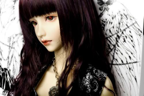
These things are ridiculously expensive... they can cost you into the thousands.

Look, it's Jareth, the Goblin King! He saw his baby crying hard as babe could cry... what could he do? Dance, Magic Dance!
(Please don't let me be the only one to get this reference...)
I've been thinking that I want to purchase Mihara Mitsukazu's Alice Addict (2003) artbook. I adore her work :) Sasuga.com's description for the product is:
"A combination of punk, Gothic and Lolita, this collection of drawings by Mihara Mitsukazu will thrill any Gothic and Lolita afficionado. It features full-color illustrations, and two pages of cut-out dolls."
(Cool & Interesting Note: Mitsukazu is also the creator of the Doll manga. It's about a world where human-like androids are created to make our existence easier. It explores the action of the users, the people and the relationships that surface between the two. What makes us human?)
(Those are wires tied up in her legs. Not a garter belt...)
Speaking of dolls, my name on here is ball-joint doll. These Asian ball-joint dolls called "Dollfie" are really beautiful. Here are some examples:
These things are ridiculously expensive... they can cost you into the thousands.

Look, it's Jareth, the Goblin King! He saw his baby crying hard as babe could cry... what could he do? Dance, Magic Dance!
(Please don't let me be the only one to get this reference...)
Is it winter yet???
I can't wait for winter to arrive because winter means snow, and snow means winter sports, and winter sports means... snowboarding! This is a very exciting time for me because it means I'll be able to fall on my face and tumble over air more than I usually do... all the while, having my feet bound to a board :) Yes, I enjoy snowboarding, even though I can only do two things; 1) move forward and 2) stop! Fun times aside, this season is exciting for one other reason. Soon, all the spiffy new snowboard designs will be on display in their full glory at sporting stores everywhere!
I've always noticed that snowboard designs are really special. There are so many to choose from, and so many colors, so there really is a perfect board for everyone out there. I think it's really neat that the designs are so versatile. Some feature very clean, slick designs, some are very loud, some are subtle and elegant, some are fun, and some are funky. Graphically, you can really find something for everyone in snowboards. It's true that the "only people" in their audience are snowboarders, but hey... just because they like sports, doesn't mean they have to have a "sporty" snowboard. They can be as loud and as expressive as each unique person :)
Here's a sample of some mens' boards:

Here's a sample of some womens' boards:

Oh... I think that a Batman snowboard would be the most awesome board in the world! It would be so sleek and sexy. Not boring and primary-colored like some other brightly-dressed superhero we know.
Sunday, October 12, 2008
I'm not really this geeky.
Yay for Batman! I was browsing online, looking for Halloween themed movies and or books that I could enjoy for the remainder of this month, and I saw this cover for a Batman graphic novel issue and got really happy and distracted because 1) I'm a huge Batman fan, and 2) I thought this cover looked awesome!
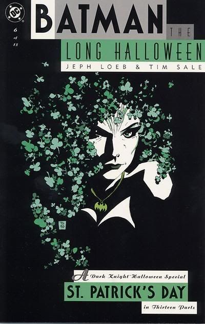
I really like this!! It's actually one in a series of 13, I believe. I feel that it's very simple and effective and totally catches your eyes because of the contrast. But even though it's simple, you can still see a lot of details.
Speaking of eye-catching Halloween-related covers... this one sort of reminds me of Rocky Horror Picture Show because of the striking colors against the black background. Huzzah for Rocky Horror as well :)

Oh, and in case you were wondering what happened to my Halloween search, it didn't get very far because once I hit that Batman cover, and it reminded me of Rocky Horror, I thought of David Bowie because of the 70's, and it was GAME OVER for my Halloween searching. I think I'll just re-watch The Nightmare Before Christmas again, as I do every Halloween season!
I really like this!! It's actually one in a series of 13, I believe. I feel that it's very simple and effective and totally catches your eyes because of the contrast. But even though it's simple, you can still see a lot of details.
Speaking of eye-catching Halloween-related covers... this one sort of reminds me of Rocky Horror Picture Show because of the striking colors against the black background. Huzzah for Rocky Horror as well :)
Oh, and in case you were wondering what happened to my Halloween search, it didn't get very far because once I hit that Batman cover, and it reminded me of Rocky Horror, I thought of David Bowie because of the 70's, and it was GAME OVER for my Halloween searching. I think I'll just re-watch The Nightmare Before Christmas again, as I do every Halloween season!
Saturday, October 11, 2008
Kinokuniya!
Yesterday I went to Little Tokyo with Jennifer Oh from my ART408 class to take some pictures for our second project. We found a graphic design section when we went to Kinokuniya Book Store! They had a bunch of really cool stuff! :) There were books for icons, books for environmental art, books for graffiti art, and pretty much anything else in the field.
They had a lot of really great things in there, though. They have books for arts & craft like origami, sewing, and various others. And of course, they had a HUGE manga (graphic novel) section. They also have CDs and DVDs, too. They also have Japanese magazines... lots and lots of them. There are even magazines for jewelry. And another one for nails. And men's hairstyles!
In case you wanna check out the bookstore, here's the address:
123 Astronaut E S Onizuka Street
Los Angeles, CA 90012
Sunday, October 5, 2008
Ricoooolaaaaa!
Swiss packaging is so fun! Have you ever had those really cool boxes with Swiss candy? I think they're ingenious because they snap close with that nice clicky feel--even though the whole box is just made of paper. And they never break either!
I also like how they have something written underneath the cap when you flip it up.

I also like how they have something written underneath the cap when you flip it up.
Saturday, October 4, 2008
Library visits.
Earlier this week, for my ART454 class at Cal State LA, I had to do a bit of researching for my first project. My professor, Jimmy Moss, suggested I try the library, so I did. It took a lot of digging and flipping through books and a paper-cut in between, but after a long while, I finally settled on six books that I could use! The process was tiring, as I had just gotten off a long day of work, but in the end, it was well worth it. I found some useful images to use, and after they were scanned into my computer, they were all nice and high in resolution! Thanks for the advice, Jimmy!
Subscribe to:
Posts (Atom)
